Reveal Video Coaching
UX Research
This piece documents my contributions to developing user-centric driver coaching functionality for Verizon Connect’s product Reveal. This was a high priority roadmap initiative from 2023-2024, and my research initiatives spanned the end-to-end product lifecycle—ideation to post-launch. Beyond the scope of this project, this high impact research continues to support the wider UX, Product, and Engineering teams at Verizon Connect as a foundation of the company’s understanding of fleet/safety manager coaching needs.
Overview
Problem
Verizon Connect Reveal customers receive hundreds of dashcam videos a day documenting potentially hazardous driving events. Improving overall fleet safety is a big priority for fleet managers, but sorting through such a large dataset quickly becomes a time consuming and costly part of day-to-day work. Our team knew from customer feedback that users wanted to efficiently comb through their data, identify improvement areas, and coach their drivers all in the Reveal platform. Such a project required a deep understanding of customer wants, needs, and existing behaviors in order to steer production goals, maximize impact, and positively impact fleet safety on the road.
Project Goal
Explore and validate customer coaching needs to ensure our coaching solution had maximum impact
Act as the ‘voice of the customer’ using research in roadmap prioritization
Steer the Product and Engineering team’s production priorities
My Contribution & Impact
I was a lead UX Researcher on this initiative. I used this work to spearhead process innovation with Dovetail, AI adoption, and internal stakeholder interviews. Overall, my work:
Launched Reveal's coaching platform.
De-risked coaching throughout development.
Modernized the research readout format.
Team
Stephanie Baione, Colin Smith, Mimi Lu
Timeline
2023 - 2025
Tools
Miro, Figjam, usertesting.com, userinterviews.com, Dovetail
Background
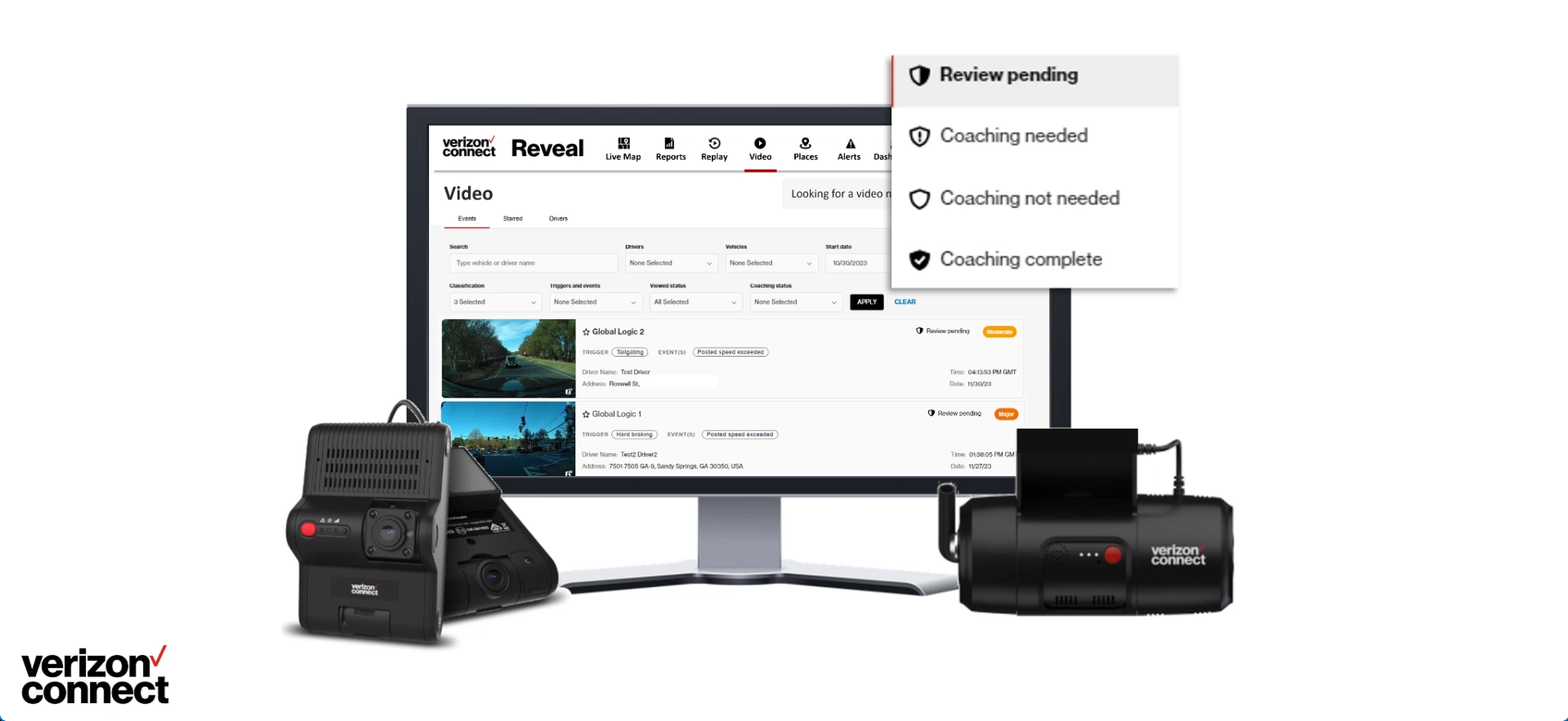
Fleet management technology like Verizon Connect’s Reveal tracks expansive amounts of information about company vehicles, doubly so if dashcams are in the picture. Reveal Video aggregates dashcam data as a list of ‘harsh driving events’, rated from minor to critical by an AI engine, and stores the videos for user review. For small fleets with well-behaved drivers, this is a handy tool for reviewing the occasional minor hazard. For medium to large to enterprise fleets, it quickly becomes an unwieldy and exponentially growing repository of videos you don’t have time to watch. We learned from user feedback that this was a common source of increased road safety risk and lost value among customers, who were too busy with other tasks to devote the necessary time to coaching.
It’s these challenges that led Verizon Connect to seek to do more with Reveal Video’s vast data repository. The team wanted to:
Empower fleet/safety managers to more efficiently comb through their data
Identify improvement areas
Coach their drivers all in the Reveal platform
It was a large, multi-year initiative, one that demanded a deep understanding of customer wants, needs, and existing behaviors in order to steer production goals and maximize impact.
This Video Coaching video shows the output of this project. This portfolio piece will tell you how we got there.
Project Goal
Explore and validate customer coaching needs to ensure our coaching solution had maximum impact
Act as the ‘voice of the customer’ using research in roadmap prioritization
Steer the Product and Engineering team’s production priorities
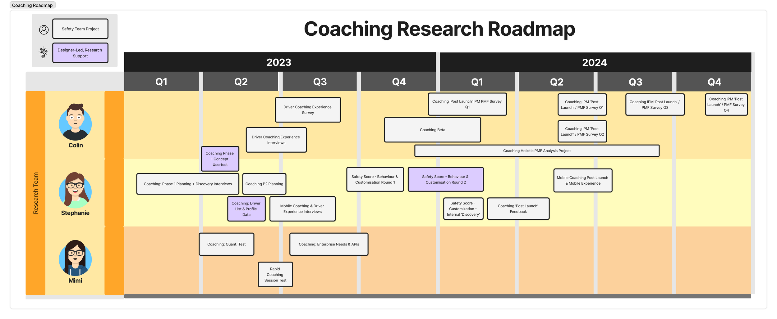
Project Timeline
This project spanned two years and over 20 research initiatives split across the team. Post launch work also continued past 2024.
White projects were discovery-focused research roadmap projects. Purple projects were designer-led, centering on design validation.
1. Defining Customer Needs
Research Goals & My Contribution
For the first half of 2023, our research team sought to elevate and validate our understanding of coaching through a combination of safety manager interviews, driver interviews, and quantitative surveys. My contributions to this phase of work focused on semi-structured safety manager interviews covering a broad range of topics to help us assess customer needs. I also provided research support for the designers seeking to validate and iterate on their work through user testing.
In-Depth Interviews on Coaching & Safety
1hr structured interviews | 10 participants
My Dovetail research readout for this work, organized into topic-based ‘insights’.
Methodology
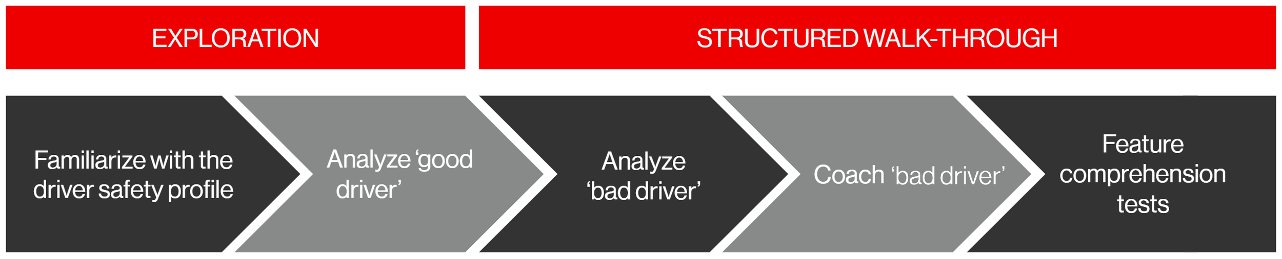
At this stage of the coaching project, our team needed fresh foundational data on customers' coaching workflows, needs, and preferences, and we also had an early-stage prototype with myriad features that required validation and prioritization. I was tasked with constructing an interview format that succinctly addressed these many needs while accounting for a wide range of potential coaching experiences—from large companies with established processes to micro family-owned businesses. I constructed my guide to accommodate for both 'yes' and 'no' answers, resulting in a thorough, responsive flow through key topics, including:
General Discussion of Coaching Processes
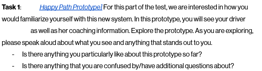
Prototype Walkthrough (Led by me via screen share)
Free Exploration (Led by participant via screen share)
Dovetail Trailblazing
With interviewing complete, I turned to Dovetail—Verizon Connect's new research repository—to analyze the data. I dove in headfirst and was the first member of the research team to analyze data and construct a research readout entirely using Dovetail (versus the team's traditional method of creating Google Slides powerpoints). This new format was a huge hit with my stakeholders on the Safety team, because it helped me amplify the voice of the customer, build deeper empathy and credibility into my readouts, and steer their decision-making with a user-centric perspective. This format was adopted by the research team and became our standard readout methodology.
Impact
Regarding research impact, my readout gave our design and product teams a deeper understanding of customers' existing coaching workflows and their immediate and long-term needs concerning core features. It greenlit the core design of the prototype reviewed, offered noteworthy iteration suggestions, identified areas for further research, and helped prioritize future coaching roadmap items.
Research Mentorship - Initial Coaching Concept Evaluations
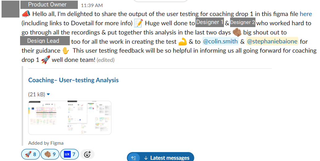
A Slack shout-out from the Product Owner leading the project.
While research sought a broader understanding of customer needs, several designer-led initiatives were simultaneously underway to evaluate prototype usability and prioritize core features. Since the designers were less experienced with research processes, I consulted and mentored the designers and product owners who participated in these initiatives. This work included:
Usability Tests (using non-customer participants)
Reviewing usability test structure and questions
Helping designers construct and launch UserTesting tests
Explaining data analysis methodologies (e.g. interview and Kano analysis strategies)
Data presentation best practices
Feature Prioritization Workshops (using internal team workshops)
Reviewing workshop format and activities
Iterating on coaching as-is journey maps
Participating in team workshops
2. Explorative Research to Steer Roadmap Priorities
Research Goals & My Contribution
From Q3 2023 to Q3 2024, our team’s research focus narrowed from foundational to explorative work, as the product and design teams needed help prioritizing the many potential coaching features that the team had slated for the roadmap. This meant our research was focused on a narrower scope and had direct roadmap impact. This phase of research consisted of interviews, surveys, and user tests on subjects like: mobile apps as coaching tools, enterprise customer API needs, safety score customization, and coaching session features. My contributions to this phase of work focused on mobile app coaching and safety score customization needs,the latter also doubling as support for designer-led research.
In-Depth Interviews on Mobile Coaching & Driver Experience
45min semi-structured interviews | 7 participants
An example of an AI summary in one of my research readout ‘insights’.
Methodology
With the previous rounds of research complete, our team shifted priorities to specific research areas we knew the least about and would most significantly impact later phases of coaching platform implementation. Two of these areas, mobile coaching and the driver experience, became the responsibility of myself and my teammate Colin Smith.
In research planning, we determined that getting an unbiased picture of drivers' wants and needs from fleet managers, our typical interview participants, was impossible. We needed to talk to drivers too. To consolidate resources and speed up our research timelines, Colin and I combined these two topics into one interview, allowing us to tackle both user groups without planning 4 separate research studies. In the end, I spoke to fleet managers about these combined topics while Colin spoke to drivers. Key topics included:
Walk me through a typical day where you use your mobile devices for coaching?
Do you use Verizon apps?
How often do you coach on mobile versus on desktop?
How much Reveal data do you share with your drivers?
Do you think your drivers want to see their data?
AI Adoption
While conducting interviews, I shared initial reactions and highlights with Colin over Slack and in our 1:1s—a process I have streamlined using Gemini's note-taking features in my more recent work. We exchanged learnings and key insights as they formed so we could complement and reference each other's work in our readouts.
After loading all the interviews into Dovetail, I once again constructed my research readout using an iteration of my process described above. Also, it was at this time that I first incorporated AI into my workflow: Dovetail had recently launched a beta for an AI summary tool, which I used to create high level overviews for each of my written insights. I was once again the first teammate on the research team to adopt and share my experience with these new features.
Impact
The impact of this research, in complement with Colin's driver research, helped our team to prioritize roadmap initiatives relating to mobile coaching and would serve as the foundation for driver needs workshops in future years of work.
Safety Score Task Analysis Evaluation
30min structured interviews | 5 participants
Methodology
The structure of our task analysis.
An example of one of our tasks.
As research continued, so did design work. One designer on the team, Daragh, expressed an interest in diving deeper into research, and his work on the coaching platform's safety score functionality needed validation. This was an opportunity for me to step in and assist Daragh in conducting task-based usability tests for his prototyped experience, and I worked closely with him in regular 1:1s to develop a research brief, research questions, select research methodology, and prepare a UserTesting test. We decided against an unmoderated flow because developing a prototype that supported free exploration required much more work, and facilitating an interview would give Daragh a higher-quality research experience.
Mentorship
After leading the first two interviews, I let Daragh facilitate the remainder. I also let him take charge of the bulk of the analysis, providing recommendations where needed. Ultimately, we developed a Dovetail research readout using my established processes and co-presented our research findings to the broader cross-functional team. I encouraged Daragh to take charge of the most important insights, including recommendations for next steps.
Impact
This research impacted roadmap decisions for safety score development and directly led to the customization research below, but it was also an important milestone for both Daragh and me: he elevated his experience with evaluative research, and I had my first experience with formal 1:1 mentorship of a junior team member. This experience directly prepared me for future direct mentorship roles, including my work on the Driver Exoneration Journey Mapping project.
Internal Discovery - Safety Score Customization
1hr unstructured interviews | 8 participants
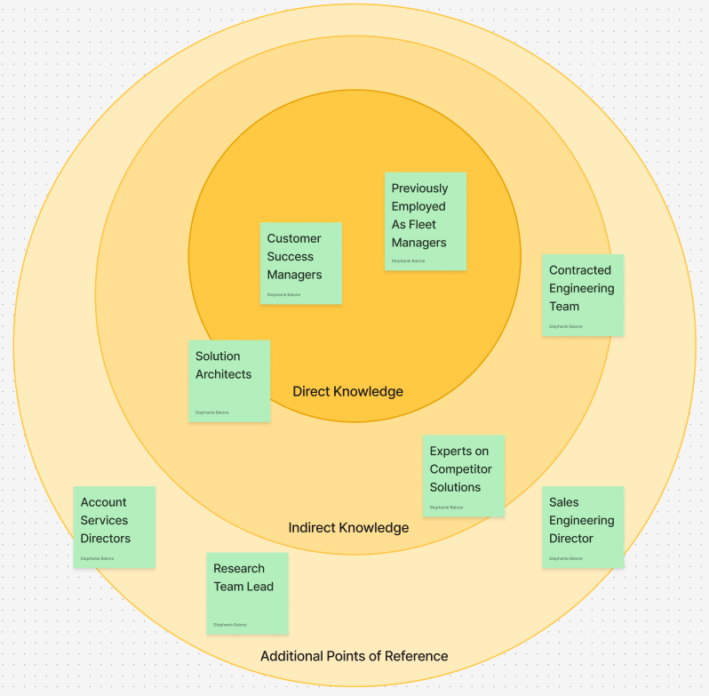
The various stakeholders we considered consulting for this research, organized by the relevancy of their experience.
Methodology
Throughout 2023, our 15 person research team (3 of us were dedicated to coaching specifically) was asking a lot from our customers. After hundreds of quick in-app surveys, interview request emails, and sweepstakes surveys, Research Operations encouraged us to go light on direct customer recruitment in Q4, where possible. This request encouraged me to get creative with my new task of understanding safety score customization needs.
This research focused on the nuances of safety scores, a feature not yet launched to our existing customers. It didn't make sense to ask them, as "how might you use this feature in the future?" is a notoriously poor research question. So I got creative: I leveraged both my and my stakeholders' internal networks at Verizon Connect and sought out experts who worked in areas that related to safety scores.
Expert Case Studies
I realized that we'd been ignoring a wealth of untapped knowledge from within our own company. My research readout turned into a rich collection of case studies, from an ex-Fleet Manager's detailed breakdown of how he calculates and weighs safety scores to a Technical Solutions Engineer's publication and data-backed talk about how safety score utilization directly improves company ROI. Not only did I answer our initial questions about safety score customization needs, but our team also gained extensive knowledge in the broader topic space.
Impact
This research had impact by solidifying safety score roadmap plans for 2024 and by expanding our foundational research material in this area of interest. I was also commended by the Safety team’s managers for my ingenuity in executing this research.
3. Post-Launch Validation and Future Thinking
Research Goals & My Contribution
Reveal’s coaching features had a rolling release, meaning that there was overlap between the previously mentioned explorative phase and the post-launch validation stage, which began in Q4 of 2023 and continued into 2025. Our team’s focus was now to evaluate the usefulness, effectiveness, and longevity of the new coaching platform through a customer beta, post launch interviews, and a recurring post launch survey. My contributions to this phase of work focused on post-launch surveys and interviews.
Quantitative Survey - Research Support
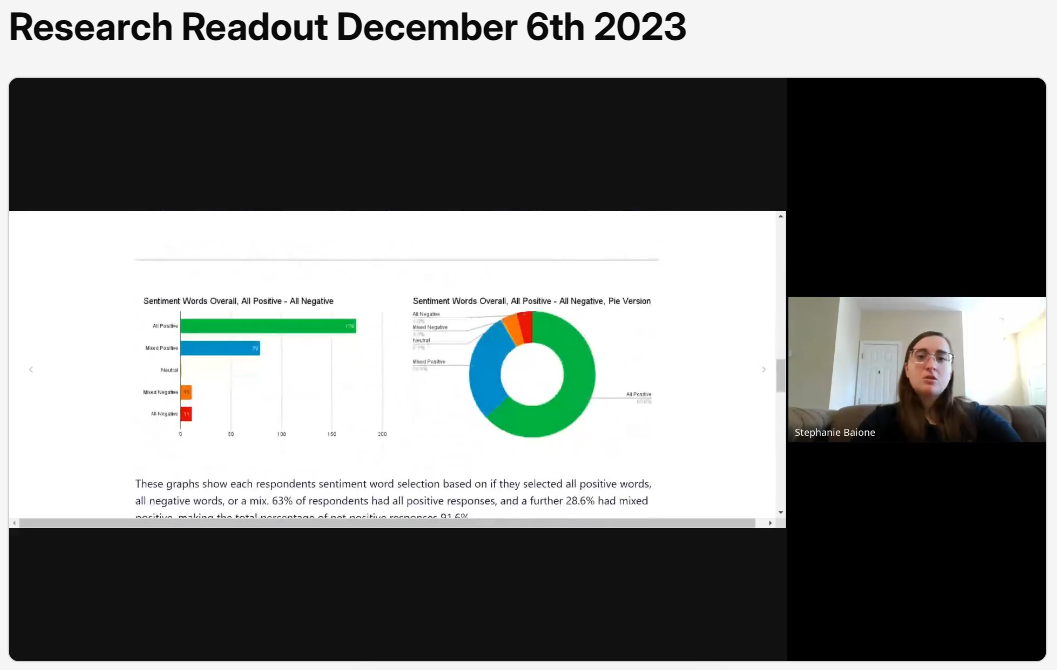
A snapshot of me sharing sentiment analysis feedback.
Methodology
Reveal's coaching features had a rolling launch in the latter half of 2023, and the first round of quarterly recurring post-launch feedback/product-market fit surveys launched in Q4. I collaborated with the other coaching researchers to propose survey questions, swarm the data analysis, and share our learnings.
Quantitative Research
One of my contributions to this research included a coaching sentiment analysis. We provided participants with a list of sentiment words and asked them to select ones that best reflected their experience. This gave us a better understanding of coaching's brand identity and product reception across different user groups, and this data complimented other the other methodologies used in the survey, such as Kano analysis and product market fit priority matrices.
In-Depth Interviews on Post Launch Feedback
1hr structured interviews | 5 participants
Methodology
In Q2 of 2024, about six months after releasing the coaching platform, enough time had passed to reasonably interview customers about their experience with the new features. To complement the quantitative work we had already done, I conducted interviews that focused heavily on product market fit, feature usage, and the effects of coaching on user workflows. This would help us to understand what aspects of coaching were still a challenge for users, what features users were the most drawn to, and how coaching adoption has changed user behavior.
Impact
As described in previous sections, I analyzed this data and shared it back with my wider cross-functional team. My contributions to this post launch research helped evaluate the coaching platform's initial reception, identify gaps in the experience, and inform new iterations of existing features.
4. Impact
Launched Reveal's coaching platform.
My research from 2023–2024 was a foundational factor driving the release of Reveal's coaching platform, as it established the necessary customer knowledge to be able to design and build with the user in mind.
De-risked coaching throughout development.
As an embedded researcher on the coaching project, I contributed over a year's worth of foundational, explorative, and evaluative research. This work's greatest recurring impact was answering the biggest questions that blocked the Design and Product teams' work. They were able to proceed with confidence as they iterated on the roadmap's main priorities thanks to my work to understand user needs and workflows.
Modernized the research readout format.
Referred to as a trailblazer by the wider UX research team, I set the standard for Dovetail-based research readouts. This has since become the default template for data share-outs using the platform, adopted by both researchers and designers, which has resulted in increased research discoverability and longevity long term.