
The dPod
UX Design | UX Research
This project was a user centered design initiative for food delivery bikers based in Atlanta, Georgia. My team worked together to understand the food delivery journey and process, identify problem spaces that could be improved through the use of technology, and design a novel solution developed from multiple phases of iterative design.
Overview
Problem
A significant portion of a food delivery biker’s travel efficiency relies on customer communication, which requires the use of a phone. As a result, bikers often have to engage in risky endeavors, such as using their smartphone while biking, or risk compromising their deadlines.
Project Goal
How can we help food delivery bicyclists communicate safely and effectively with customers while on the go?
My Contribution
UX Research: literature review, interviewing, card sorting, and affinity mapping
UX Design: brainstorming, sketching, storyboarding, low and mid fidelity prototyping, and physical prototyping
Team
Stephanie Baione, Yiming Lyu, Niharika Mathur, and Shelby Reilly
Timeline
August 2019 - December 2019
Tools
Figma, Balsamiq, Adobe XD, Tableau, Adobe Illustrator
Background
This project was my team’s primary undertaking in CS/LMC 6755: HCI Foundations at Georgia Tech. We were given almost no guidance in developing our project parameters so that we could freely identify a need within our community and iteratively develop a solution. The only requirement was that the project be related to the theme of “on the go.” We identified our user group as Atlanta food delivery bicyclists.
After some initial research and brainstorming, we learned that delivery bikers are surprisingly underrepresented in the food delivery technology sector. Think of all the major food delivery applications that utilize bikers for delivery (Uber Eats, Grubhub, DoorDash etc.). While these apps have comprehensive systems for customers and vehicle-based delivery drivers, there are no app journeys designed specifically for delivery bikers. Even companies famous for their bikers’ delivery efficiency like Jimmy John’s have not invested in designing technologies to help their bikers do their jobs. We set out to change this.


Project Goal
How can we help food delivery bicyclists communicate safely and effectively with customers while on the go?
Project Timeline
This project took place from August 19, 2019 - December 16, 2019. As the team’s project manager, I was in charge of developing the team’s schedule, monitoring progress, and ensuring that everyone stayed on track.

This schedule provides a summarized view of all the research and design work my team conducted throughout this project.

This project’s main stages, simplified.
Dark green denotes research work, and light green denotes design work.
Phase 1: Research

Picking a Topic and Understanding User Needs
Topic Brainstorming
My team was given free creative liberty with selecting our topic space, and we spent a full week considering different potential “on the go” user groups. We focused our efforts towards identifying users who would be interesting to study, would meet the topic requirement, and/or both. Each member of our group brainstormed individually, and we then shared our ideas with the group and continued to ideate further. Some of our top ideas are listed in the image on the right, but our most notable favorites included: left handed individuals, food delivery bicyclists, and non-native speakers ordering takeout in store.

In order to pick our final ideas, we rated each idea based on the following criteria:
Accessibility: Can we access this user group on or around Georgia Tech’s campus?
Feasibility: Does this group fit our project requirements? Will we have enough research subjects for studies?
Uniqueness: Will this user group be interesting to study? Will we be stepping out of our comfort zone?
During this phase, we eventually decided to work with “food delivery bicyclists who want to safely utilize navigation while on the go.” We voted for this user group because it was by far the most unique of all our ideas, and we believed that the high volume of Jimmy John’s restaurants around Georgia Tech, who are known for their “freaky fast” bike delivery services, would satisfy our accessibility and feasibility requirements.
Understanding Target Users
1. Literature Review
2. Interviewing Users
3. Affinity Mapping
Literature Review
This literature review was conducted by watching YouTube videos and reading through news articles about our user group. We had no limitations on what resources or content we included so long as they related to food delivery biking.
Research Goals: We were aware that most of our research would be limited to Atlanta. In order to combat this limited perspective, we wanted to conduct a literature review that included information from other cities and countries. Additionally, seeing as our knowledge of our users was extremely limited at this point, we hoped to gain a broad enough understanding of the food delivery biking journey to be able to ask users questions during an interview.
My Contribution: I read a number of news articles and assisted with data synthesis and organization.

Findings: We gained a general understanding of the job, such as typical compensation and commonly used apps (DoorDash, UberEats, GrubHub, and Caviar) while also noting a few potential pain points in the user journey. These points included: when the user stopped to utilize navigation assistance, waiting at the restaurant for the food to be ready, and waiting for customers at their delivery locations.
Findings: We accomplished our research goal of understanding the delivery journey from order reception to order drop off. We also learned a significant amount about the food delivery biker community, culture, and values that we did not expect to find. The full extent of these findings will be discussed in the Affinity Mapping and Research Findings sections.
2. Interviewing Users
For our interviews, we consulted with five food delivery bikers in Atlanta. This work contributes to the majority of the design decisions made for the remainder of this project. Four of these interviews were in person, and one was over the phone. These users were between 21-31 years old and consisted of four men and one woman. Four of these individuals were Caucasian and one was South Asian. Their work experience ranged from one and a half years to more than ten.
Research Goals: We intended for these interviews to provide us with the bulk of our research data for this project. We hoped to understand and map out the entire delivery journey for our users, identify common pain points, and identify common delivery biker archetypes and characteristics.
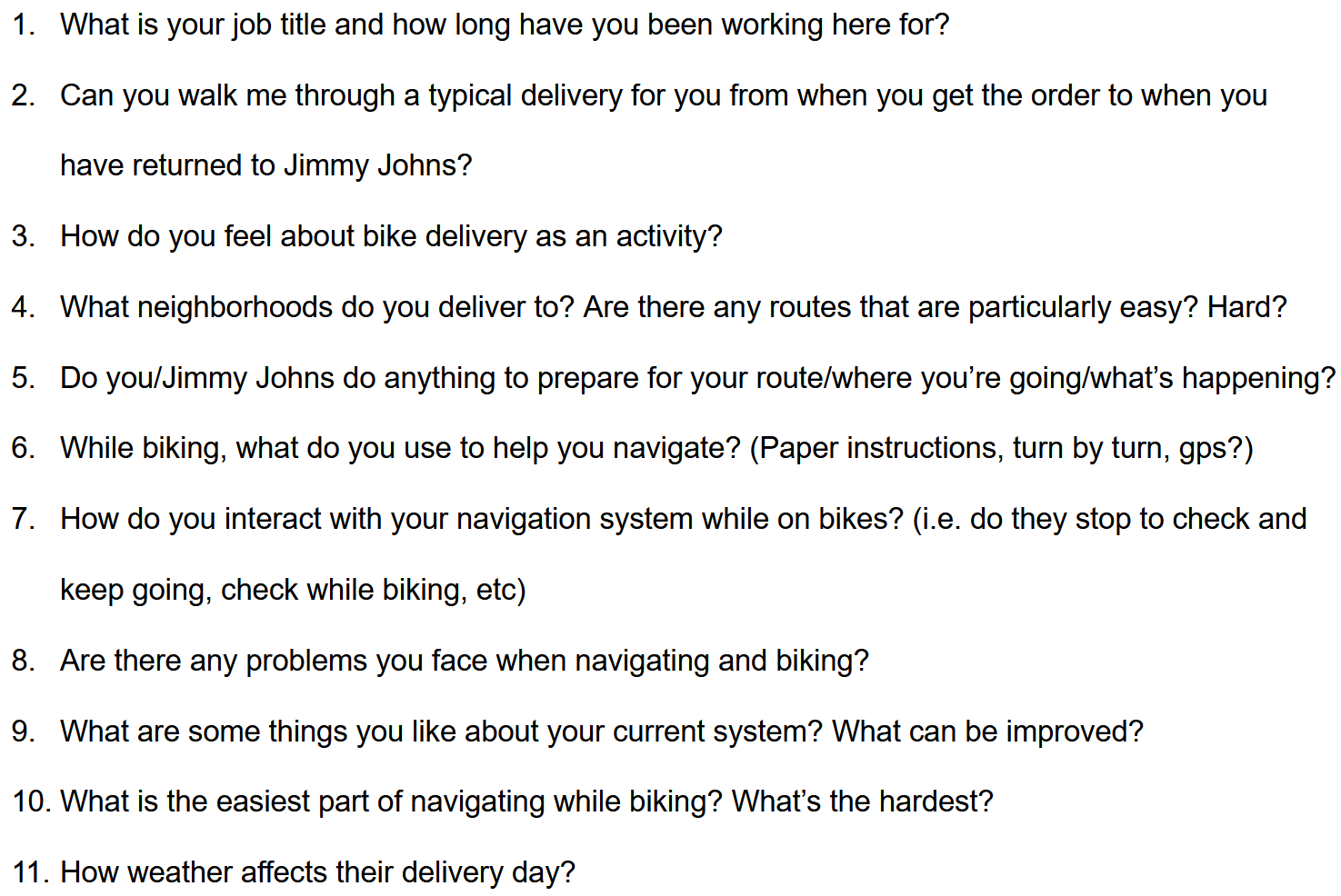
My Contribution: I wrote the entire interview guide, conducted two interviews, and acted as the team’s interview scheduler (I found and invited four of the five interviewees to talk with us).
A Retrospective: I cannot express enough what a revolutionary experience these interviews for me as a researcher; these interviews were my first lesson in, well, interviewing, but also being careful not to assume anything about your users. I sat down to interview my first participant in a Jimmy John’s on 14th Street in Atlanta with a list of questions about his experience with utilizing navigation while biking. Except, as I was soon to learn, he never used navigation while biking. As an experienced food delivery biker, he was expected to know the area around his restaurant so well that he could operate more efficiently than a GPS.
At first, I was nervous. Safely using navigation was a critical component of our entire project! What were we going to do if our problem statement fell through? This moment was when I realized that we were wrong to think that anyone but your users can tell you what they want or need. It was a lesson in humility - when I, the stupefied novice researcher, had all my assumptions thoroughly shot down, I realized I could only do one thing: listen. My interviewee was my teacher, and he was relaying intimate details of a life and profession that I did not previously have the capacity to understand. It was a broadening in perspective that taught me about the amazing potential of research that will stick with me for all my time as a researcher.
3. Affinity Mapping
We developed this affinity map as a team for one long 4 hour session after generating the yellow sticky notes the day before. We read each sticky out loud and decided as a group where it would fit on the map. We then engaged in multiple periods of silent work time where we reorganized the map in ways we believed were more logical. The end result is shown below.
Research Goals: This affinity map was our primary method of analyzing our research findings. We hoped that it would allow us to organize the plethora of information we acquired during the literature review and interviewing stages and assist us in generating potential solutions.
My Contribution: I prepared about a quarter of the yellow sticky notes and moderated the affinity mapping session.
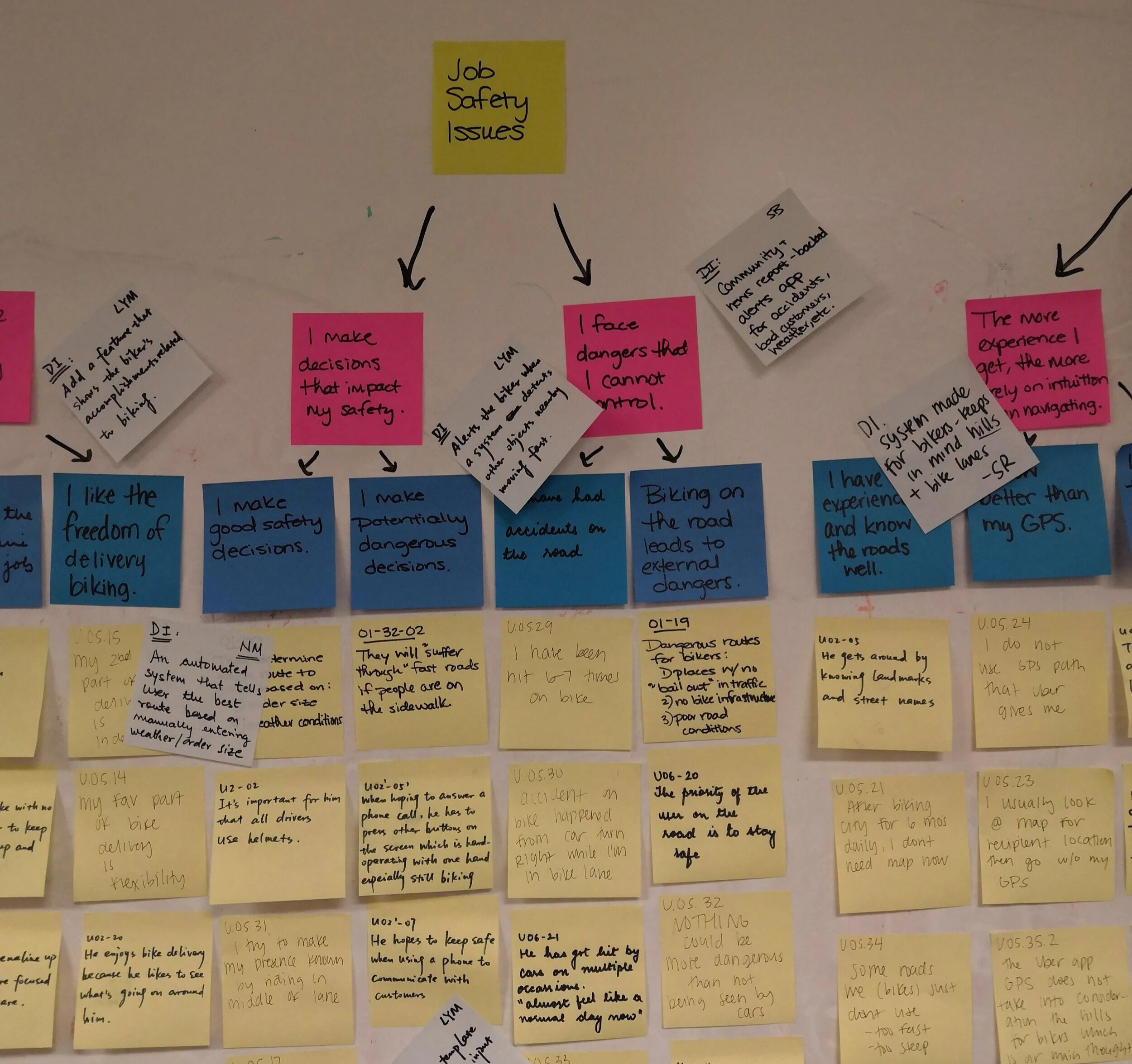
Findings: From our affinity map, we generated a number of potential solutions (white sticky notes) based on sections of the affinity map’s hierarchy. This would help us with the solution brainstorming process and identifying the most actionable elements of a biker’s delivery experience.

Findings (Literature Review, Interviews, and Affinity Model): The above affinity model represents the culmination of our research work for this project. On the model itself, all sticky notes were organized into five broad green categories, which included: problems with existing systems, job satisfaction, job safety issues, tradeoffs between experience and assistive tools, and work efficiency. Below the yellow sticky notes are the design implication (white) sticky notes. These represent ideas generated from analyzing the affinity model. Our evaluation of these ideas will be discussed in the section “Beginning Solution Generation.”
Research Findings
The overarching goal of this research phase was to isolate a target user group, understand them and their work journey, isolate pain points, and use this knowledge to begin generating solutions to the pain points we could influence with the intervention of technology.
User Characteristics
Every food delivery biker has a similar delivery journey. They begin with receiving an order request. From here, some bikers will bike to the restaurant preparing the food, while others already work at said restaurant and wait for the order to be prepared. Once they have received their order(s), they bike to their delivery location(s). When they are close to arrival, they must alert their customer and wait to confirm the delivery and receive their tip. When all their deliveries are complete, they either return to their restaurant or check their phone, where they will accept a new order request.
While the overall beats and pain points in a food delivery biker’s work journey is relatively constant throughout the business, we learned that there are three distinct types of food delivery bikers. These pseudo-personas would become critical for our design thinking, as some solutions would benefit some groups of delivery bikers more than others.

Single Restaurant Employees
Food delivery bikers work for restaurants because they provide flexibility with work schedules and workload. Many single restaurant employees are part time and have other jobs, as they use food delivery biking as a means of making extra money doing something they enjoy.
These bikers are usually given 2-3 orders at a time. They make use of an existing order reception system that usually works on the restaurant platform. These restaurants usually employ people who are familiar with the neighborhood.

Third Party Application Employees
Delivery bikers who work for third parties are typically held to stricter schedules because they often work full time. Biking is seen as their primary source of income, though many of them chose the job because they enjoy biking.
These bikers accept and deliver one order at a time. They are also always provided with an in-app order and delivery system, which means that they can manage their deliveries and pay remotely. This leads to them having access to assistive delivery tools (i.e. navigation) and more experience navigating large areas,

Independent/Standalone Bikers
Independent bikers are intentionally unaffiliated with large businesses because it provides them with complete freedom to work their own hours and reject orders if they need to. These bikers are almost always employed part time and work to make extra money or support their fitness goals.
These bikers decide how many orders to take at any given time. However, because they are not associated with a particular company or restaurant, they do not have access to official ordering systems and deliver over a larger geographic area.
Isolating Pain Points
Below is a virtual reproduction our affinity model’s green and pink sticky notes. The bottom row represents a high level overview of all our major findings. The pink sticky notes represent pain points, and purple sticky notes (changed from pink for visual clarity) represent major themes. We separated pain points and themes in our results because pain points were universally negative experiences, whereas themes were positive sentiments and necessities within our users’ work. Our solution generation was based on ideas developed from examining these critical pain points and themes.

The top two levels of our affinity model, displayed above. For another, more in-depth view of each pain point/theme, click here.
Beginning Solution Generation


Upon completing the affinity model, our team spent a week analyzing the board synchronously and asynchronously (shown above, left). Whenever we came up with a design implication, we wrote that idea on a white sticky note and placed it on the model by the sticky note that gave us the idea.
After our analysis time had expired, we moved all the white idea sticky notes below the model and evaluated the quality of each idea. We did this by having the members of our team rate each idea on a scale of 1-5 based on two criteria: creativity and practicality (shown above, right). The most highly rated ideas would be incorporated into our divergent design (shown right).
While this process helped us to identify clear, feasible solutions to our user group’s problems, it also helped us to identify problem areas that were more actionable than others. For example, many of our design ideas (1, 3, 4, 6, and 12) were related to customer interaction. This would allow us to develop divergent designs that were based on solving particular pain points rather than simply combining multiple ideas.

Phase 2: Divergent Design

Brainstorming and Design Ideas
Brainstorming
Pulling from the design ideas listed in the Beginning Solution Generation section, our team set out to begin brainstorming designs. We began with 30 minutes of individual sketching to ensure that we were not pigeonholing our solution ideas with group think. Afterwards, we compared ideas and worked together to refine the ideas we deemed as having the most potential.

An example of our individual brainstorming sketches

An example of our team refining a promising design idea
Design Ideas
At the end of this divergent design sprint, my team developed three major potential solutions. The solutions predominately diverged in two areas: what paint points they were solving and which user subgroup would most benefit from the technology. This section will detail these designs, the differences between them, and their intended benefit to the food delivery biker user group.
Design 1: InTouch
This design idea features a smartphone application and was designed with the intention of helping food delivery bikers communicate effectively with customers while biking. This solution was geared primarily towards Independent Bikers and also towards Third Party App Employees. It was intended to be the cheapest and most versatile solution.

After receiving a delivery request, the user is able to manually input delivery order information, which would be saved for future repeat orders. The user can also use the “Autocall” feature, which will automatically call the customer when the biker is a specified number of minutes away from the delivery location.

The InTouch would include functionality that allowed bikers to access recent and frequent delivery locations. Additionally, they would have access to diagnostic data, which would help them manage their budgets and track their miles. Finally, it would have the ability to link with other third party apps so that third party bikers would get the benefits of both applications.
While en route, the app displays directions to their delivery location. The user also has access to a call button, which would allow the biker to call their customer in one click rather than having to dial the full number while on the go.
Features: The InTouch would consist only of a mobile application, so the user would only need a smartphone to utilize it. The user would be expected to supply their own headphones to make full use of the calling features.
Strengths:
Text message updates to customer on biker’s progress that encourage the customer to be engaged with the biker’s delivery journey
No cost to purchase the design on the part of the biker
Design is versatile and can be used on any phone and with any set of headphones
Provides independent bikers with assistive delivery system to communicate with customers
Pairs with existing delivery systems like Uber Eats
Weaknesses:
Complicit with bikers wearing potentially noise-cancelling headphones while on their bikes (which is a safety hazard)
The manual information input process is slow
The design requires the user to take one hand off of their bike handles to press the call button
Currently has no method to input multiple deliveries at once
Text messaging is not implemented in this design
This design currently does not have functionality for calling restaurants.
Design 2: CoPilot
This design idea is a delivery app compatible AR glass interface with a scroll control on the bike’s handlebar. It was designed with the intention of being optimally safe for navigation and communication on the road, as the user does not need to look down in order to use it. This solution was geared primarily towards Third Party App Employees. It was the most expensive but most cutting edge solution.

The user would have access to immediate call, text, and navigation assistance while on the road. By connecting to a third party application, the user would be able to access and call their delivery recipient’s phone by scrolling through a list of preloaded options. The user would be able to do the same with pre-typed text messages that they can change in the settings.

In addition to the aforementioned features, this design would also support visual location sharing via a camera on the glass, access to both restaurant and customer phone numbers while biking, and a multiple order prioritization system.

To promote safety while biking, the CoPilot would only give the user access to the settings page while the biker is stationary. This setting would prevent users from being tempted to utilize more complicated features when they should be focusing on the road.
Features: The CoPilot would consist of the AR glass interface and a scrollbar controller that would attach to the handlebar. The AR glass would attach to the biker’s helmet and have a built-in microphone and speakers for taking calls.
Strengths:
User does not need to take their eyes off the road to look down in order to view their interface.
The scrollable control is easy for the biker to access as it is located directly on the handle with easy reach for the thumb.
The scrollable control is easy to understand in terms of the vertical menu interface on the glass.
The user is able to update their settings using the system itself whenever they are stopped and this allows for a seamless experience.
The set-up of the AR glasses functions well with the helmet bikers utilize and makes set-up easy.
Detachable control and detachable AR allows bikers to travel easily on the go with their equipment.
Weaknesses:
System would be a bit more costly than other methods--would work best if purchased by the company, not a biker.
The scroll design could be confusing as driver currently utilizes a scroll function for shifting gears while on the road.
System may leave a small blindspot where the AR Glass interface is projected on the glasses
The use of the AR glass might affect the ability for the biker to utilize sunglasses or glasses while biking.
The system has to be taken on and off each time biker gets on and off bike--this could take extra time in the beginning stage of adoption.
Design 3: The dPod
This design idea is a circular screen interface with a joystick control on the bike’s handlebar that connects to a smartphone application. It was designed with the intention of being an assistive communication tool on the road. This solution was geared primarily towards Single Restaurant Employees. It was more expensive than an independent biker could pay for but had the most intuitive conceptual model for interaction.

The dPod has call, text message, navigation assistance, and order tracking functionality. The user would interact with the dPod by moving the joystick in the direction of the feature they with to use. To use the call feature, for example, the user would push the joystick upwards and push down to select. This would navigate them to the calling menu.

These screens show all the dPod’s potential features, which have been mentioned previously. The main screen would display the user’s current delivery information. Also, whenever the user would navigate deeper into the information architecture (i.e. into the Navigation Assistance section), the back button would always be available at the top of the screen.

The dPod phone application would connect to a restaurant’s order database and allow them to claim orders they are delivering. This process would allow the user to select which deliveries they want to cover, choose the order in which they make those deliveries, and then transfer the delivery information to the dPod for access on the road.
Features: The dPod would consist of a circular interface that would attach to the center of the biker’s handlebars. A joystick control would sit on one of the handlebars to be easily accessed by the user’s thumb. The dPod would also have a connected application that would pull from a restaurant’s database of orders and allow the user to select which orders they are delivering. This system would come with a set of bone conduction headphones, which allow the user to hear the road around them while taking calls on the road.
Strengths
The dPod helps users work efficiently and safely since they can utilize the dPod’s functionality while still having both their hands on the handlebars at all times.
When the user is struggling to navigate the road or is lost, the dPod provides users with quick access to both real-time present location display and turn-by-turn navigation assistance.
The dPod helps users safely and efficiently make phone calls or send notification messages to customers with simple, easy operations compared to the unsafe practice of calling/texting while on a bike.
When delivering more than one order at a time, the dPod allows users to efficiently check and manage all the orders while biking on the road.
The dPod establishes a simple, intuitive conceptual model for users since the input device and the output device match each other in terms of both their circular appearance and configuration pattern.
Weaknesses
Users primarily rely on their thumb to operate the input device (joystick) of dPod. Compared to existing electronic devices such as smartphones or tablets, the current input method of the dPod has very limited gestures for operations (only rotate and click), which could bring restrictions for users if they hope to perform a series of complex tasks or do not have good finger dexterity.
New users of the dPod need to look down to view the output device (circular interface) while biking on the road, which might be distracting or even pose a safety risk for them.
Since the dPod is a comparatively new system for most users, they might need extra training or time to adapt. This may temporarily affect the biker’s delivery efficiency.
Phase 3: Prototype Development

Convergent Design and Design Refinement, and Prototype Generation
Convergent Design

This chart represents how each of our design ideas ranked with our peer feedback. 1st refers to the InTouch, 2nd refers to the CoPilot, and 3rd refers to the dPod.
After completing Phase 2: Divergent Design, our class put together a poster session where all the class’ teams presented their design ideas. During this session, we were given feedback by our peers based on three criteria: feasibility, novelty, and addressing the problem.
From this feedback, we identified the folliwing major findings:
The InTouch as the most feasible design idea
The InTouch and the dPod were voted highest for addressing our problem space
The dPod was nearly unanimously voted as the most novel
Based on this feedback, we were torn between implementing the InTouch and the dPod. After consultation with our professor, we were encouraged to pursue novelty in our designs over practicality for the sake of learning in a classroom environment and developing a unique system. Therefore, we pressed onward with plans to implement the dPod.
Feature Refinement

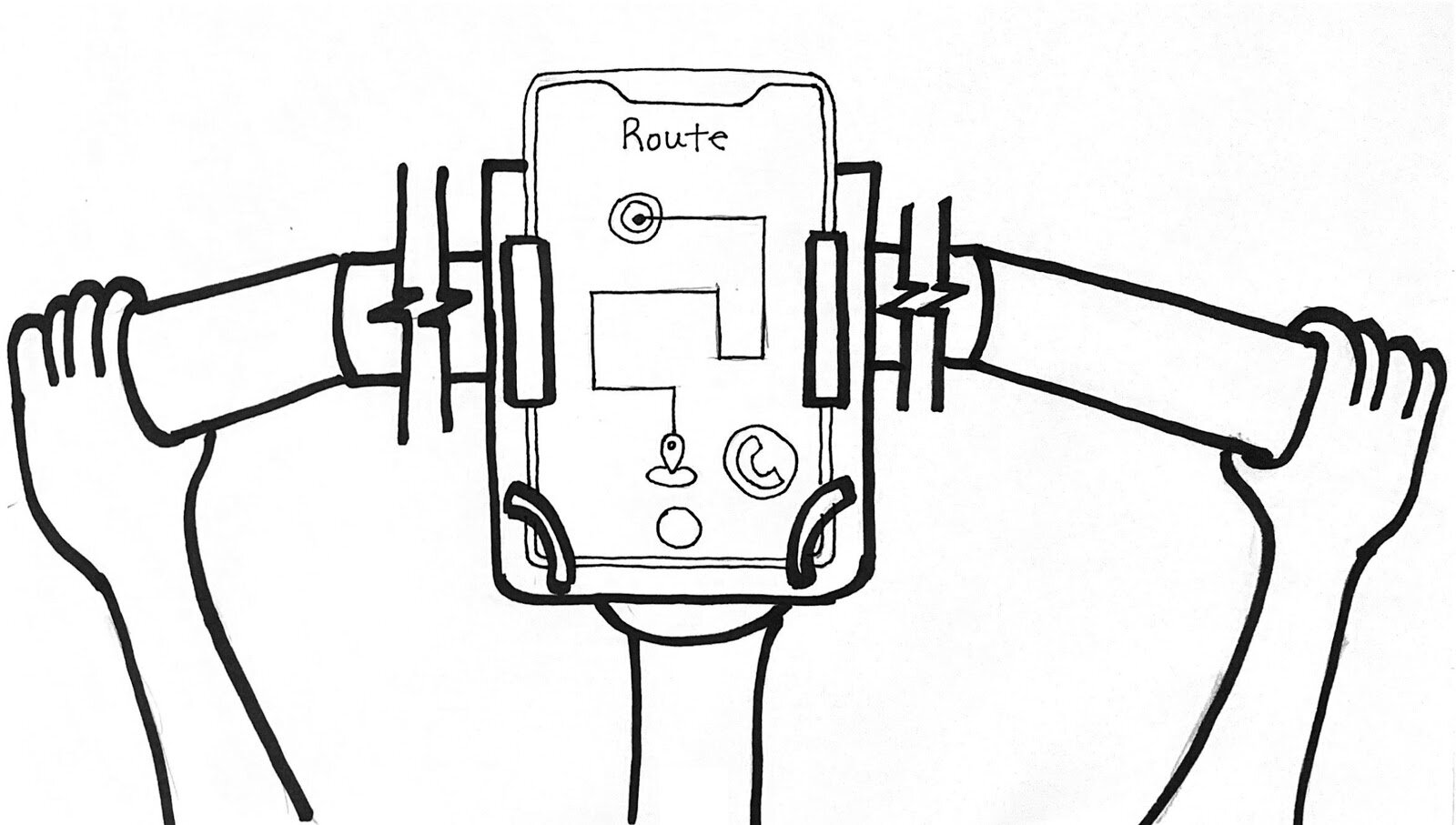
I created a sample dPod circular interface out of pink foam to test the size and placement of the device on a bicycle. The interface has a 4 inch diameter and a 1 inch thickness and can be attached and detached from the bicycle as needed so the biker does not have to worry about potential theft.

The detachable, flat joystick device is the primary navigation control for this system and is mounted to the side of the handlebar. Given that the user is familiar with the navigation controls, the 4 major input directions allows the user to memorize action patterns and use the system without looking down.

Bone conduction headphones are a special type of headphones that sit on/around the ear and allow the wearer to hear their surroundings while also listening to their headphones. Our users will need to call their customers while on the road, and these headphones provide them with a safe method of communicating without obstructing their ability to bike safely.
Mid Fidelity Prototype Generation
This section will show our team’s first prototype of the dPod system. This version was developed for the purposes of fully understanding all of our system’s features as well as using it for a prototype evaluation. This prototype was developed in Figma.
My Contribution: I assisted in the development of the phone application’s screen designs and helped link up the screens for testing.
The dPod Phone Application

The dPod application featured a set of launch pages that allowed the user to input their personal information (left), understand the dPod system (middle), and set text pretexts and coworkers’ numbers in the app (right) before they left for an order.

A single restaurant employee has the ability to choose which restaurant to link to the app (left). Once they are set up, the delivery biker can select incoming orders from the restaurant’s delivery system (middle) and claim them as their own (right).

We also incorporated features in the dPod application for third party application employees. The user would have the ability to link their account to any third party app (left and middle left), view the available orders (middle right) and claim them for delivery (right).
The dPod Interface
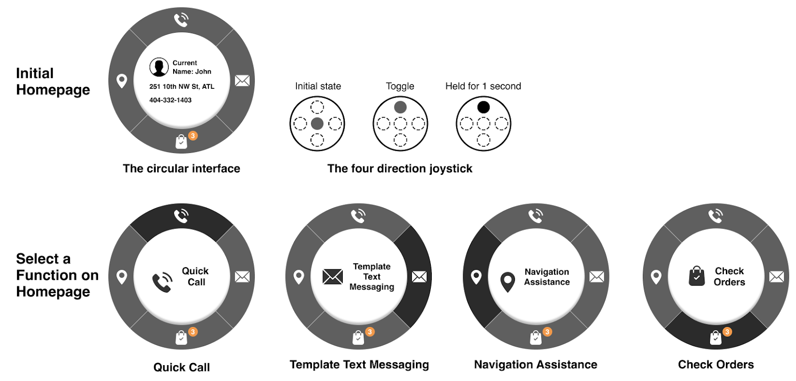
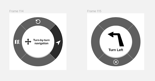
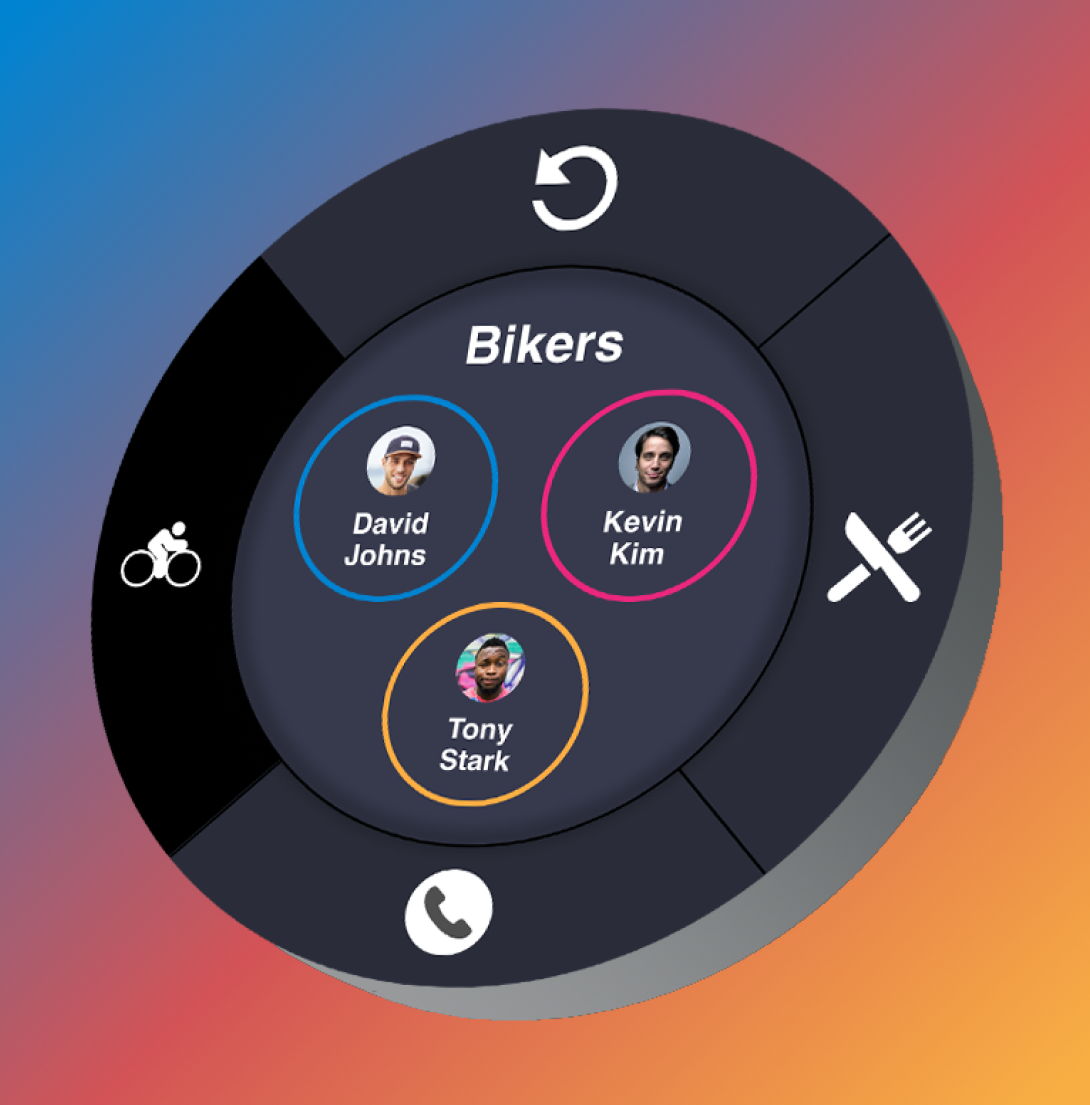
Above represents the main four functions of the dPod system. When the joystick is in it’s initial state, the user sees the current delivery’s information. By toggling the joystick in any of the 4 directions, it updates the view to display the name of the functionality: quick call, template text messaging, navigation assistance, or check orders. Holding the joystick in the direction of the desired functionality will bring the user to the next page of the information architecture.

The above designs show the different calling functionalities available in the dPod. The top row displays the process of calling a customer, the middle row displays the process of calling other bikers, and the bottom row displays the process of calling restaurants. Hitting the back arrows at any point in this process navigate the user to the previous page of the information architecture.
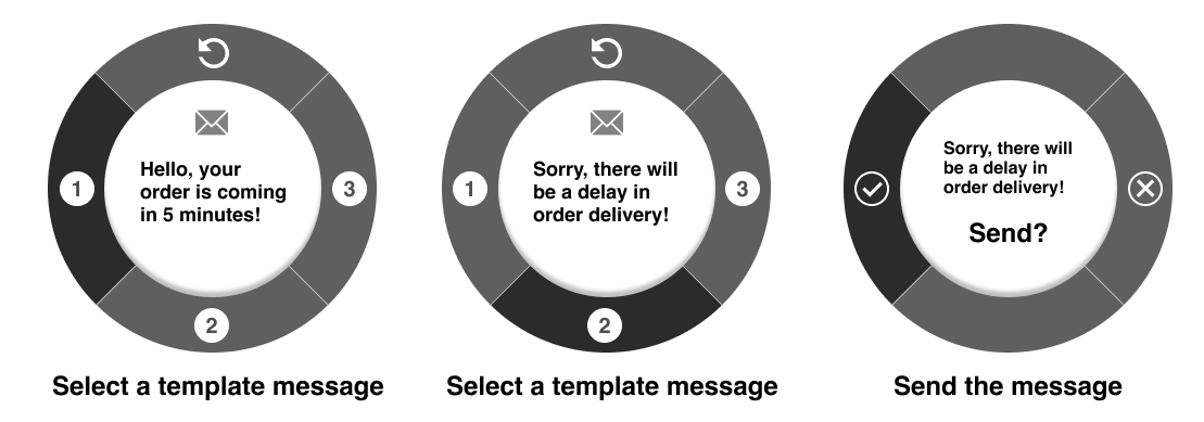
The above designs show the text messaging feature. As shown in the dPod phone app, the user is able to add up to 3 prewritten text messages to the dPod, which they can select while on the road. This message will be sent to the saved number for the current delivery customer.

The above designs show the different navigation functionalities available in the dPod. The top row displays the “share locations” feature, which lets the user access an overhead map view as well as views of their and their delivery locations positions on a map. Also, bottom row displays the “turn-by-turn" navigation” functionality, which would direct the biker similar to a GPS.

The above designs show the check orders feature. Once the user is on the road, they have already selected the order in which they want to deliver their orders. Through this feature, they are able to mark orders as complete as well as switch the primary navigation to different orders that they have loaded into the dPod interface.
Phase 4: Prototype Evaluation

Usability Specifications, Discount Evaluation, and Feedback
Usability Specifications
Our usability specifications were the metrics by which we judged the effectiveness of our design. To develop them, we first had to clearly establish the objectives of the dPod design. Our objectives are as follows:
System improves communication between bike messengers, restaurants, and customers.
System improves navigation concerns for bike messengers.
System organizes bike delivery process better for bike messenger and for restaurant chain/bike delivery companies.
System is usable, efficient, and safe while biker is in transit.
With these goals clearly defined, we identified a number of usability specifications to ensure that we met those goals.
Learnability
Learnability: The ease of understanding how to operate a system
Target: 75% of participants should be able to complete each task within 30 seconds
Predictability: The effect of system operations needs to be determinable by interaction history
Target: 75% of participants should be able to correctly predict what the system ends up doing
Familiarity: Matching users’ expectations and prior knowledge
Target: Users get an average of 75% or higher on matching icons to their functions
Consistency: Likeness in input/output behavior arises from similar task objectives
Target: 65% of participants should be able to complete the task first try
Target: 95% should be able to complete task after 4 tries
Generalizability: Extending specific interaction knowledge to new situations
Target: 75% of participants who report having used joysticks regularly will rate the interaction system as intuitive
Flexibility
Dialog-Initiative: Who controls dialog flow
Target: Users rate the ability to abandon, suspend, or resume their system-based tasks as a 7 or higher on a 1-10 scale
Multi-Threading: Supporting simultaneous tasks
Target: 75% of participants are able to complete tasks simultaneously
Customizability: Interface can be adapted to suit different needs
Target: Observe that 90% of users are able to arrange tasks in order to customize to their preference
Robustness
Observability User Impression of System State:
Browsability: Are bikers able to explore states without modifying system?
Target: 100% of bikers should be able to complete task of browsing system without making a change
Reachability: Are bikers able to navigate through observable states?
Target: 85% of Users should be able to complete task on observable states
Recoverability: Support for undoing errors
Target: We hope for a 90% yes rate for this specification throughout testing of the phone app and call interactions
Responsiveness: Feedback should be commensurate with action
Target: Open-ended. We hope to gain qualitative evidence by recording positive responses to the responsiveness of our system over-all
Task Conformance: Degree to which the system supports user's tasks:
Task Completeness: Can system perform all tasks
Target: 100% yes rate from the participants
Task Adequacy: User ability to understand tasks
Target: 100% yes rate from the participants
Discount Evaluation
This evaluation is described as “discount” because there was extremely limited time remaining in the semester to complete it. As a result, we had smaller sample sizes than would typically be expected for evaluations such as these.
Our evaluation plan consisted of three components: a usability testing session for the phone app, a usability testing session for the dPod interface, and a card sort for system iconography.
Due to limited time, we were only able to schedule one usability testing session with a food delivery biker. In order to supplement this small number of participants, I recommended that we perform usability tests with our peers in the class. During the usability test with the biker, our goal was to learn how effective the system would be with respect to his work. Meanwhile, in the usability tests with our peers, we inquired about design standards, aesthetic, and system flow. Four of our peers participated in this test.
Contribution: I acted as a moderator and note-taker for the usability testing sessions and moderated all the card sorts.

A food delivery biker tests out our dPod system. We utilized Wizard of Oz to simulate interaction with the joystick while the user was riding his bike. The user would declare what action he was taking with the joystick, and we would click through the dPod system, which was visible on the iPod resting near the center of the handlebars.


One of our peers tests out our dPod system. Since our focus in these tests was the design of the system itself, we did not incorporate the Wizard of Oz that we used for the food delivery biker. The user clicked through the dPod and app Figma prototypes and used think aloud as they completed tasks.
Usability Testing: The phone app test consisted of a think aloud walkthrough of the app’s major features while a moderator asked the user to complete tasks to do so. Once that was complete, we performed a short interview to ask them about their experience using the app. The dPod interface test included similar think aloud, task-based walkthroughs of functionality and a short interview at the end. Once users had experienced the entire system, we had them complete a SUS survey and complete a Microsoft Desirability Reaction Words Test, the results of which will be discussed in the Evaluation Feedback section.

Card Sort: This closed card sort was a test to verify whether or not users were able to accurately organize the dPod’s information architecture according to their corresponding icons. Again, due to the discount nature of this evaluation, we only had time to perform this test with two participants. However, even a test as simple as this one yielded some interesting and important results with respect to validating our system’s usability, recognizability, and organization. The results of this test will be discussed in the Evaluation Feedback section.
Evaluation Feedback
We were extremely satisfied with the results of our evaluation. The feedback was largely positive and included a number of areas for improvement within the design that were not significant changes to functionality or system design. With respect to usability criteria, we were able to meet all of our target goals. Some criteria were met more completely than others, however, and there were a number of minor adjustments that surfaced during testing. Some of those adjustments will be discussed further in this section.

Our mid fidelity prototype received a SUS score of 76. This is higher than the average score of 68 and was a satisfying reminder that we were on the right track with respect to developing this system. It is also worth noting that our food delivery biker participant rated the system a 97.5.

To analyze the reaction words, I developed an interactive word bubble visualization in Tableau. The reaction word system has two pieces: first users select all the words that they believe represent the system. Afterwards, they select the top five words. The bubbles’ color and size represents how many times a word was selected in the participant’s top 5 words. Meanwhile, the column of words on the right show how many times a word was selected. To interact with the visualization, click here.
Consistency
The left image shows the back arrow consistent throughout the application, and the right image shows the cancel button to turn off turn-by-turn navigation. These icons are different despite causing the same thing to occur within the system.

Customizability
Some users liked the “Send?” confirmation page, which appears after the user has selected a template text message to send to their customer, whereas others thought this would waste time. Users wanted the choice to turn this functionality on or off.

Convenience
Users had to hover over slots 1, 2, and 3 in order to remember which bikers were set to which number. They wanted the list of bikers to be displayed on the first screen they see in this hierarchy.

Predictability
Some users interpreted the orange ‘C’ on the order page to represent “Complete,” whereas the actual meaning was “Current.” Users wanted a more recognizable icon/label for this feature.

Familiarity
The “Bikers” menu icon was identified as confusing because it did not represent bikers so much as “people.” Users wanted the iconography to resemble a biker.
Phase 5: Final Evaluation
Final Design, Summary, Research Limitations, and Self Reflection
Final Design
Incorporating all the feedback we received during our Discount Evaluation, our team commenced one final sprint to complete the final iteration of the dPod system’s design in Adobe XD in preparation for our end-of-semester poster session.
Contribution: I assisted in designing and writing the poster.
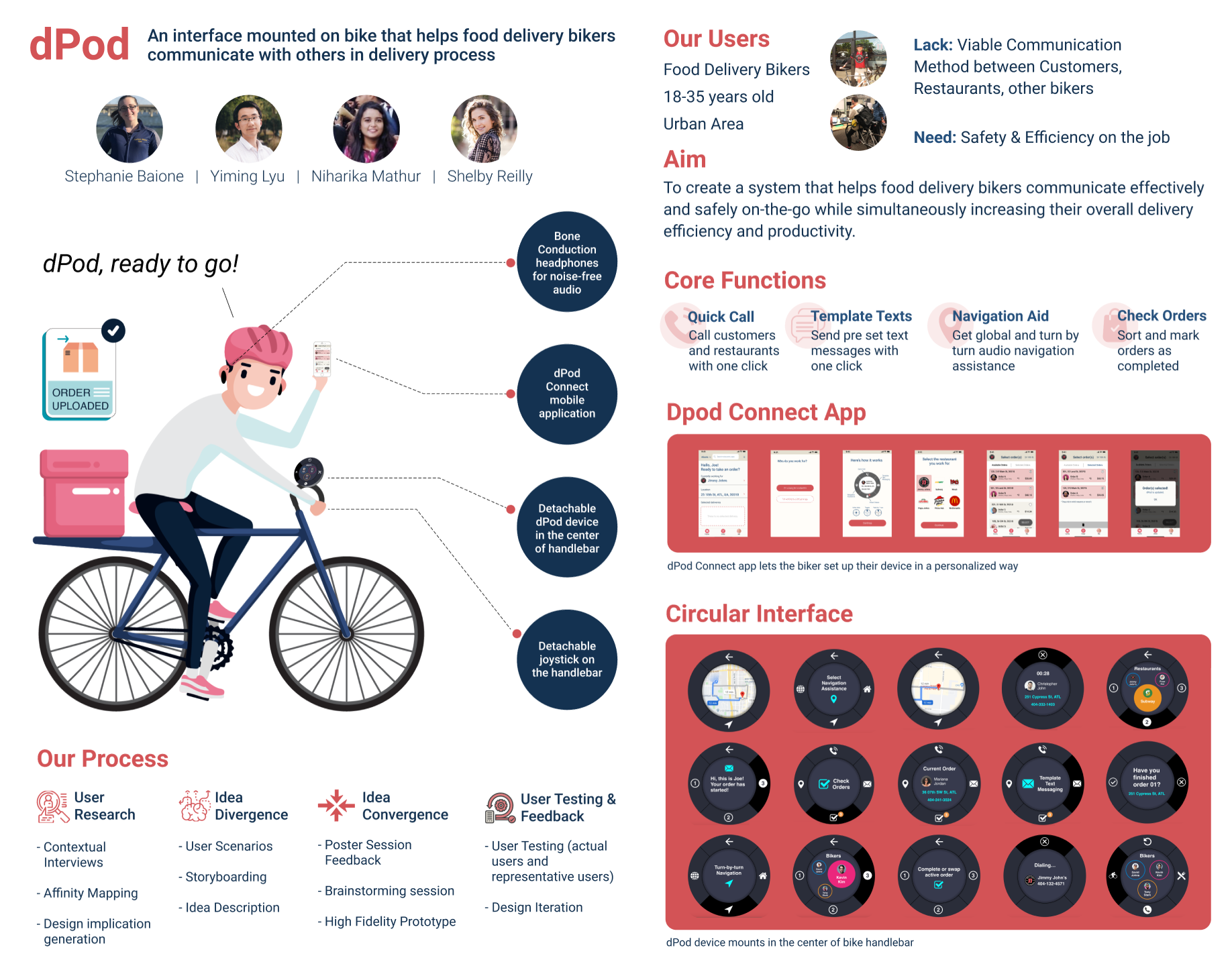
This was our poster explaining the functionality of the dPod as well as our research and design process, our target users, and our goals.
Click here to demo the dPod circular interface
To interact with the system, use the arrow keys to hover over options and the enter key to select.
Summary
Over the course of these 16 weeks, our team set out to develop a system that assisted food delivery bikers in communicating effectively while riding their bicycles. Our final prototype, designed based on the needs and testimonies of food delivery bikers, came to be after various stages of divergent and convergent design and iteration. The dPod system, which proved to be the best of our various solution ideas, had a clear mental model for use, was simple and efficient, and was well received in our discount evaluation, receiving a SUS score of 76. But most importantly, our system received high praise from a food delivery biker who participated in and followed the development of our system from the research phase onwards.
Research Limitations
As mentioned previously, this project was developed in a class that focuses primarily on design. As such, while the research portions of this project were important to developing an effective design, they were not our priority with respect to the class’ grading system. As a result, we had small sample sizes both during our initial research and during our discount evaluation. If we were to continue this project, we would need to perform these validation tests with a variety of food delivery bikers from all of our previously identified sub categories and with individuals from different cities.
This system was not implemented in full - time constraints only allowed for the interactive portions of the system to be tested. As a result, we never had the opportunity to design a physical artifact to test. At this time, more research would be needed to prototype a physical dPod and test it properly on the streets.
Self Reflection
This was my first major UX Design undertaking. Being the researcher that I am, I often found myself gravitating towards the research elements of this project (especially the affinity mapping - that was by far my favorite part of everything we did). However, this project encouraged me to step out of my comfort zone and explore design. I am very grateful that I had a talented team working with me, as I find the process of design creation more difficult than design refinement.
One thing that took me by surprise during the dPod’s development was the level of investment and passion I found myself having for it. This experience was largely due to the user group. To be honest, we selected the user group of food delivery bikers because it fit the topic of “on the go” and seemed more unique than some typical on-campus topic like “students on Birds/Limes” or something generic like “left handed people.” But little did we know, we had stumbled upon a group of passionate, talented, diverse people who are extremely underrepresented and unseen in their industry. I sat down for a call with an independent biker and asked him about his job and started hearing about delivery biking triathalons, biking zines, and a close-knit community of people who look after each other. As a result, when I pitched our ideas, I felt like I wasn’t just designing something, but designing for someone. Even while knowing that the dPod system would never see real development (unless my team wants to make a start up!), I felt genuine pride in making these people feel heard. For me, the dPod took on a life of its own and truly became a labor of love.
This portfolio piece is dedicated to Frogi, the food delivery biker who infected me with his passion for food delivery biking. You inspire me every day to grow as a UXer and to love my job half as much as you do.
An additional but equally as important thank you also goes to my wonderful teammates, who worked those late nights with me, our professors, who guided us in the right direction, and our users, who made all of this possible. Thank you so much.
And finally thank you, reader, for coming along on this journey with me.
Check out some of my other work below.